[soundcloud url=”https://api.soundcloud.com/tracks/247576204″ params=”color=ff5500&auto_play=false&hide_related=false&show_comments=true&show_user=true&show_reposts=false” width=”100%” height=”166″ iframe=”true” /]
To watch the video recording of this episode, click here
If you’re a regular listener of the podcast, chances are good you sell a product or service online. And if you sell a product or service online, chances are even better that you have a website.
Hopefully you know full well how critical it is for the success of your business that your website does its job. A poor website can be a death sentence for your online business.
Never fear, though: if your website is less than stellar, the only thing that may stop you from fixing it is not knowing how to do so. That’s why this episode of the Coders’ Startup is about how you can improve your website.
First, a little background. The other day, during our weekly mastermind group call, Carter mentioned he had recently redesigned the website for United Business Leaders.
I took a look at the website and immediately had questions, comments and concerns to share with Carter, but we didn’t get the opportunity to do so during the call. We later had the idea that I could deliver my feedback on the podcast and make an episode out of it.
This will be a case study, then, of how you can change a mediocre website into a great website that will convert well. Take the tips and rules of thumb we present in this episode and apply them to your own website wherever you see opportunities for improvement.
Let’s begin with an important question that will inform our analysis of the website.
What Is the Purpose of the Website?
As a disclaimer, Carter informed me that he put up this website very quickly, using a basic LeadPages template. But why did he bother to do it at all? What is the purpose the website is serving right now?
His answer: it is a placeholder, and it exists primarily so that someone looking into Carter’s business will find something other than a blank page.
UBL’s paid acquisitions are directed to other lead pages, so this website is mostly for referral business. Carter explained that he feels unprofessional if his email signature doesn’t contain a URL for his business.
This is an unusual purpose for a business website. For an average business owner who sells online, their website’s purpose will be to either sell a product or collect leads.
As a general piece of advice, it’s very important to know what your website’s purpose is and to only try to make it do one thing.
If your website’s purpose is to generate leads, then all it should do is ask for email addresses. If its purpose is to sell a product, then you should pitch your product, and that’s all.
Don’t make the same mistake I did and try to make your website do multiple things at once, because chances are good it will do none of them very well.
My old design for javavideotutorials.net tried to simultaneously collect leads, make sales, and give away free information, and it did not perform well. After I redesigned it solely with lead acquisition in mind, my business surpassed the six-figure income mark, and I credit this accomplishment largely to my redesign of the website.
So, design your website to do one thing, and do it well. Create multiple websites for your multiple business needs (e.g. lead acquisition and sales) when necessary. You’ll thank us later.
For our case study, we’ll assume the purpose of Carter’s website is to collect leads, since he does include a contact form. My critiques and suggestions will be aimed at making the website more effective at collecting leads.
First Impressions and Button Copy
A good place to begin is with the first screen a visitor will see when they enter Carter’s website. Check out the following screenshot:
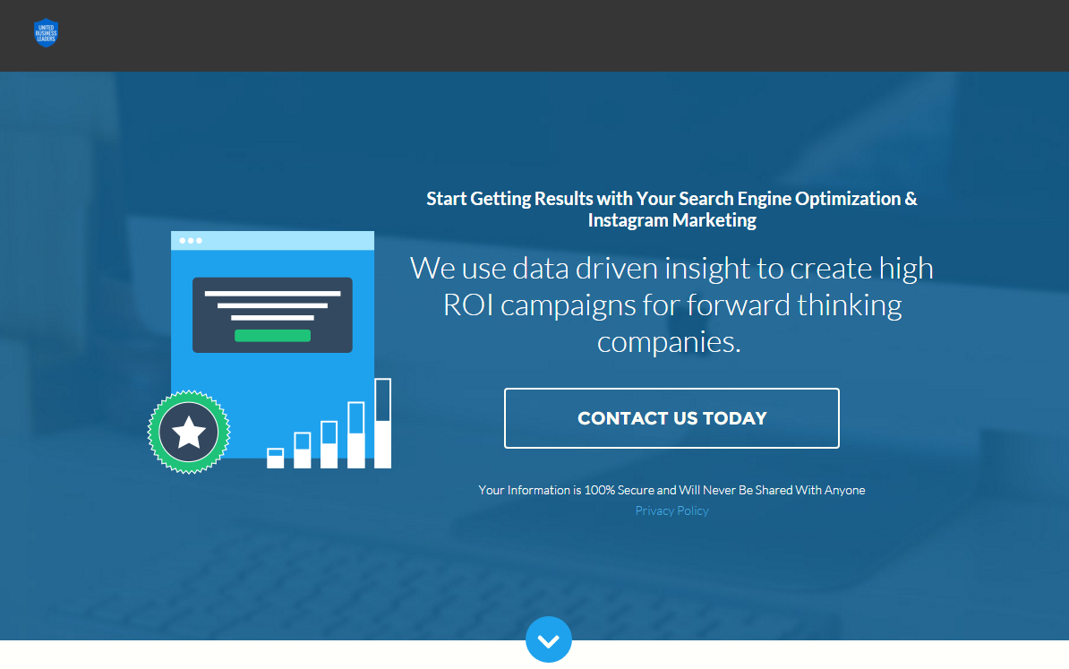
What we have here is almost like a welcome gate: there is a header, subheader and prominent call to action. It’s great that Carter has his call to action right there on the first page, and the design is clean and simple, which typically increases conversions.
However, the copy on the page could use some work. First up, when it comes to convincing your customers to take action, the copy on the clickable areas or “buttons” on your website tends to matter most.
Carter’s button reads, “Contact us today.” Frankly, this is pretty boring.
The copy on your buttons needs to be compelling and benefit-driven, and it should usually be in first person (using pronouns like “I” and “me”). You want your copy to speak directly to your visitor and explain how taking action will personally benefit them.
To improve Carter’s button copy, we could change it to, “Show me how to optimize my site,” or even just, “Optimize my site.” This is a lot better than “Contact us today” because it immediately informs the visitor how they will benefit from clicking.
You can also consider adding “now” to the end of your button copy, as my own split-testing has shown this increases your conversion rate by 10-20%.
Header and Subheader Copy
Now on to the copy of the header and subheader. I should begin by saying there’s no exact science to creating compelling header copy.
You will probably not create your most successful copy on your first attempt. You’ll have to try a few different variations and test them out to see what works best.
To begin this process, I like to use CoSchedule.com’s Headline Analyzer tool, which we mentioned back in our episode on copywriting. You can type your headline into a text box and receive a score out of 100, based on factors like word choice and number of words.
For example, if I enter Carter’s headline from the first page, “Start Getting Results with Your Search Engine Optimization & Instagram Marketing,” the tool gives it a score of 47/100. This is not a very good score (the website recommends 70 or higher).
The word balance of this headline is not bad, but it could use more uncommon words, emotional words, and “power” words. The headline type is “generic,” and it will perform better if we change it to one of the other three types: list, “how to,” or question.
Let’s change the headline to make it more effective. First, we’ll try, “How to Increase Your Traffic with SEO and Instagram Marketing.” This headline scores 69, which is better, but still not great.
Next, we’ll try phrasing it as a question: “Do You Know How to Multiply Your Traffic with SEO & Instagram?” This variation scores a 72, so Carter could take this headline and run with it. He could then come up with a few more variations and run split-tests to see which one converts best.
Carter would also want to repeat this process for his subheader to make sure it’s as strong as possible. Remember, the purpose of your headline is to get visitors to click on your button and enter your sales funnel, so make it compelling. Your business depends on it.
The Lead Collection Form
If the purpose of your website is to turn visitors into leads, then the process should be as painless as possible. You want to minimize the number of barriers preventing a person from becoming a lead.
This usually means asking for the minimum amount of information possible to collect the lead; in most cases this is an email address.
Here’s a screenshot of the pop-up window that appears when you click on Carter’s call to action button:
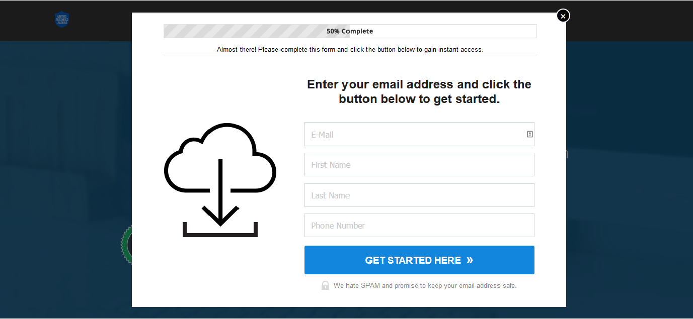
As you can see, the form asks for four things: email address, first name, last name (which Carter clarifies should actually be “Company”), and phone number.
As I said, it’s usually best to ask for the least amount of information you’ll need to collect the lead, but as Carter explains, all of this information is necessary for his business.
His team has previously run tests on the amount of information they ask of a lead, and they’ve found that qualifying the lead works a lot better for their sales funnel.
Qualifying your leads is a legitimate strategy and can actually save you a lot of time you might have otherwise wasted developing leads that turned out to be bad fits for your business. Think about whether sheer quantity of leads or quality of leads is better for your business.
One note in regards to the copy on this form. The headline above the entry fields is very generic: “Enter your email address and click the button below to get started.” It would be better if this text focused on the benefits your visitor will receive when they sign up for your email list.
Carter should try something like, “Can’t wait to get started with your SEO results?” This would almost certainly increase conversions, as would including a custom image in the pop-up box instead of the default cloud/download graphic.
The Rest of the Website
Moving below the fold, Carter provides some additional information about his offer:
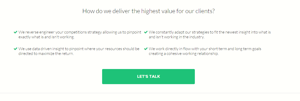 I don’t have any problems with this, and once again, the formatting is nice and simple. The check boxes function as bullet points, which catch people’s eyes as they skim through the page, and the copy offers some additional information about how the SEO process works.
There are also redundant call to action buttons here and throughout the rest of the page, so people are repeatedly reminded to sign up. This is great, but Carter needs to be sure to use strong, benefit-driven copy on all his buttons.
Next is an introductory blurb about Carter:
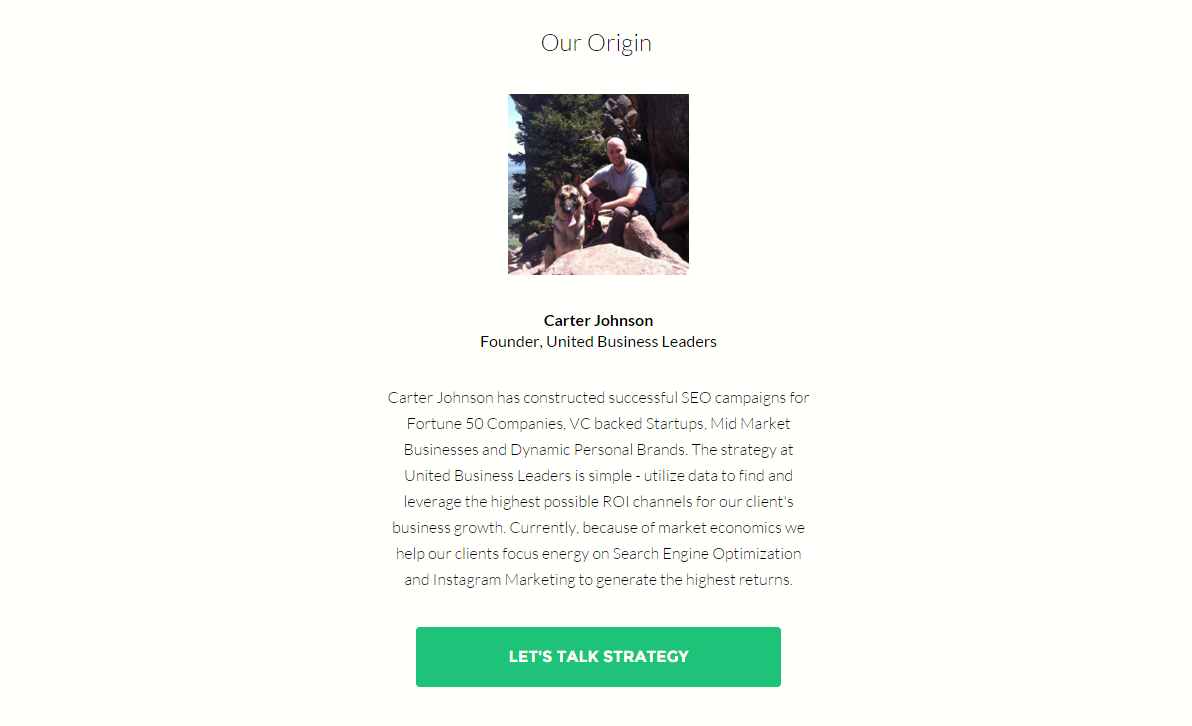 This page works fine because it gives a personal touch and builds authenticity for Carter and his team. It lists different types of businesses for whom they have worked and reiterates their strategy in a nutshell. All of this serves as supplemental information to convince visitors that Carter’s services will be worth the cost.
Now comes my favorite part of the website (though Carter hates how the formatting isn’t correct):
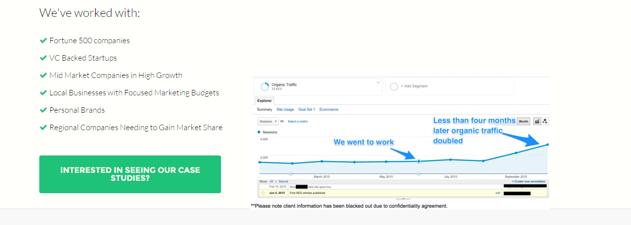
Beside some more check boxes listing types of clients for whom he has worked, Carter inserts a screenshot from a client’s Google Analytics page that shows organic traffic growth over time.
Carter indicates the time at which his team began their work, and he shows that the website’s organic traffic had doubled four months later.
These are huge results. To put it in perspective, 90% of my business comes from organic traffic, so if Carter could double my organic traffic in just four months, it would practically double my business!
I love this page so much because it provides indisputable evidence that Carter delivers results. I think it’s the most compelling element on the website, and I would recommend he find a way to move this above the fold so people immediately see it when they enter the website.
The most important part of your website is what your visitors see when they first land on the page. This is where you will get most of your leads or conversions, so naturally you should put your most compelling material right there, front and center.
Carter could also add some client testimonials to compliment this graphic. The ideal number of testimonials is five. If you don’t have five, then show three, and if you don’t have three, then show one fantastic testimonial.
I think the ideal layout would feature testimonials from former clients beside graphs showing the results Carter achieved for each client. That way visitors would be able to read his clients’ praise and also see the hard evidence that backs up their recommendations.
If Carter could get these testimonials and accompanying graphs above the fold of his website, then that would be all the better.
Closing Thoughts
Overall, the changes that need to be made to the website are minor, and most relate to the very top of the page. Carter needs to change a few headers, come up with new copy for his buttons, move his graph and include a few more graphs like it, and add some testimonials.
I would bet my life savings that if he split-tested the current page against a new one with the proposed changes, the new one would convert better.
We hope you can apply the lessons from this case study to your own website to increase your conversions and grow your business. Just remember you always need to think about the benefits you are providing for your customer and communicate them clearly and consistently.
We’re skipping our regular book and app recommendations this week, but I do have a teaser for an upcoming episode. Andrew O’Brien of Patefactus will be our guest for the episode which should go live on March 3rd.
He specializes in getting you media coverage (television, newspapers, magazines, etc.) without the use of a PR firm. He has a magic formula for getting the media to notice you, reach out to you, and invite you to do an interview. He is very excited to share his knowledge, and we’re thrilled to have him on the show!
Look for that on March 3rd, if all goes according to plan. Take care until next time, and stay tuned for more invaluable marketing advice.
LINKS
CoSchedule.com Headline Analyzer tool